Designed to align aroma and flavour — so every sip reads clearly.
Developed in collaboration with a world-class brewer, this cup is shaped to reveal how aroma and flavour move together. A quiet but deliberate tool for experiencing coffee with greater clarity and balance.
Co-developed with Ryan Wibawa
The Harmony Cup is a porcelain coffee cup co-developed with Ryan Wibawa, two-time Indonesia Brewers Cup Champion (2016, 2024) and 3rd place finisher at the 2024 World Brewers Cup. It was created to address a simple but rarely solved question: how can a cup help drinkers perceive aroma and flavour as one continuous experience?
Highlight Complex aromatic profiles
At its core, the Harmony Cup is designed to enhance the sensory flow of specialty coffee—particularly light to medium roasts with complex aromatic profiles. Its form is derived from ORIGAMI’s Aroma Series, which emphasizes aroma retention, combined with the outward-curving rim geometry of the Pinot Aroma Cup. This hybrid structure allows volatile aromas to accumulate inside the cup and release naturally as the cup is lifted, engaging the nose before the coffee reaches the palate.
The rim angle plays a critical role in how coffee enters the mouth. By controlling the point of contact and the speed of flow, the Harmony Cup spreads liquid evenly across the tongue—from the tip to the sides and toward the back—making sweetness, acidity, body, and finish easier to distinguish without exaggeration. This creates a layered tasting experience where individual flavour notes are easier to identify, yet remain integrated.
Colour
Beyond shape, colour is treated as part of the sensory design. Matte finishes were selected not only for visual restraint, but for their psychological influence on taste perception. Neutral tones allow the coffee’s natural colour and aroma to take center stage, while select colours subtly reinforce acidity or sweetness, supporting the overall harmony of the cup.
Made from Japanese porcelain, the Harmony Cup balances refined aesthetics with durability and practicality. It is suitable for daily use, professional café service, and competitive environments alike—designed to faithfully translate a barista’s intention from extraction to the final sip.
Want to learn more? Check out this blog!
Co-developed with a World Brewers Cup finalist
Shape designed to retain and release aroma
Flared rim for smooth, even flow onto the palate
Enhances clarity of sweetness, acidity, and body
Colour options informed by sensory perception
Suitable for home, café, and competition use
Designed to align aroma and flavour — so every sip reads clearly.
Developed in collaboration with a world-class brewer, this cup is shaped to reveal how aroma and flavour move together. A quiet but deliberate tool for experiencing coffee with greater clarity and balance.
Co-developed with Ryan Wibawa
The Harmony Cup is a porcelain coffee cup co-developed with Ryan Wibawa, two-time Indonesia Brewers Cup Champion (2016, 2024) and 3rd place finisher at the 2024 World Brewers Cup. It was created to address a simple but rarely solved question: how can a cup help drinkers perceive aroma and flavour as one continuous experience?
Highlight Complex aromatic profiles
At its core, the Harmony Cup is designed to enhance the sensory flow of specialty coffee—particularly light to medium roasts with complex aromatic profiles. Its form is derived from ORIGAMI’s Aroma Series, which emphasizes aroma retention, combined with the outward-curving rim geometry of the Pinot Aroma Cup. This hybrid structure allows volatile aromas to accumulate inside the cup and release naturally as the cup is lifted, engaging the nose before the coffee reaches the palate.
The rim angle plays a critical role in how coffee enters the mouth. By controlling the point of contact and the speed of flow, the Harmony Cup spreads liquid evenly across the tongue—from the tip to the sides and toward the back—making sweetness, acidity, body, and finish easier to distinguish without exaggeration. This creates a layered tasting experience where individual flavour notes are easier to identify, yet remain integrated.
Colour
Beyond shape, colour is treated as part of the sensory design. Matte finishes were selected not only for visual restraint, but for their psychological influence on taste perception. Neutral tones allow the coffee’s natural colour and aroma to take center stage, while select colours subtly reinforce acidity or sweetness, supporting the overall harmony of the cup.
Made from Japanese porcelain, the Harmony Cup balances refined aesthetics with durability and practicality. It is suitable for daily use, professional café service, and competitive environments alike—designed to faithfully translate a barista’s intention from extraction to the final sip.
Want to learn more? Check out this blog!
Co-developed with a World Brewers Cup finalist
Shape designed to retain and release aroma
Flared rim for smooth, even flow onto the palate
Enhances clarity of sweetness, acidity, and body
Colour options informed by sensory perception
Suitable for home, café, and competition use
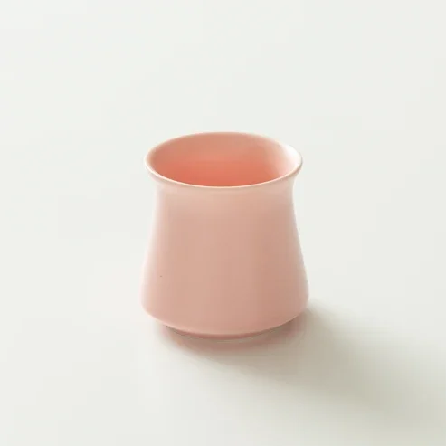 Image 1 of 6
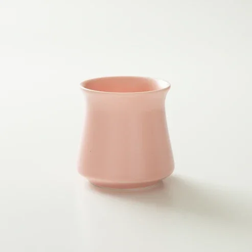 Image 2 of 6
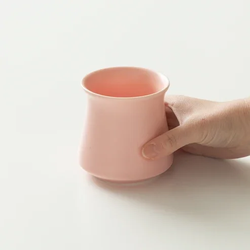 Image 3 of 6
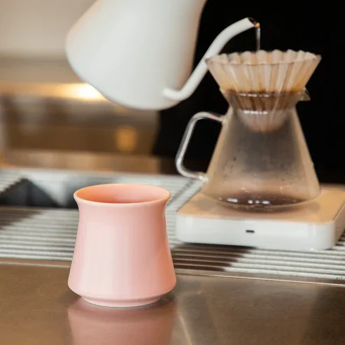 Image 4 of 6
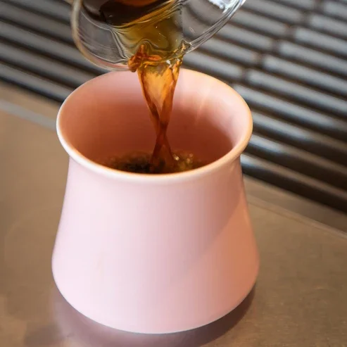 Image 5 of 6
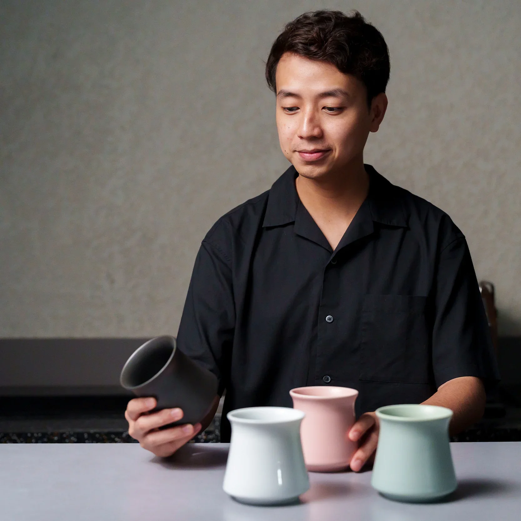 Image 6 of 6